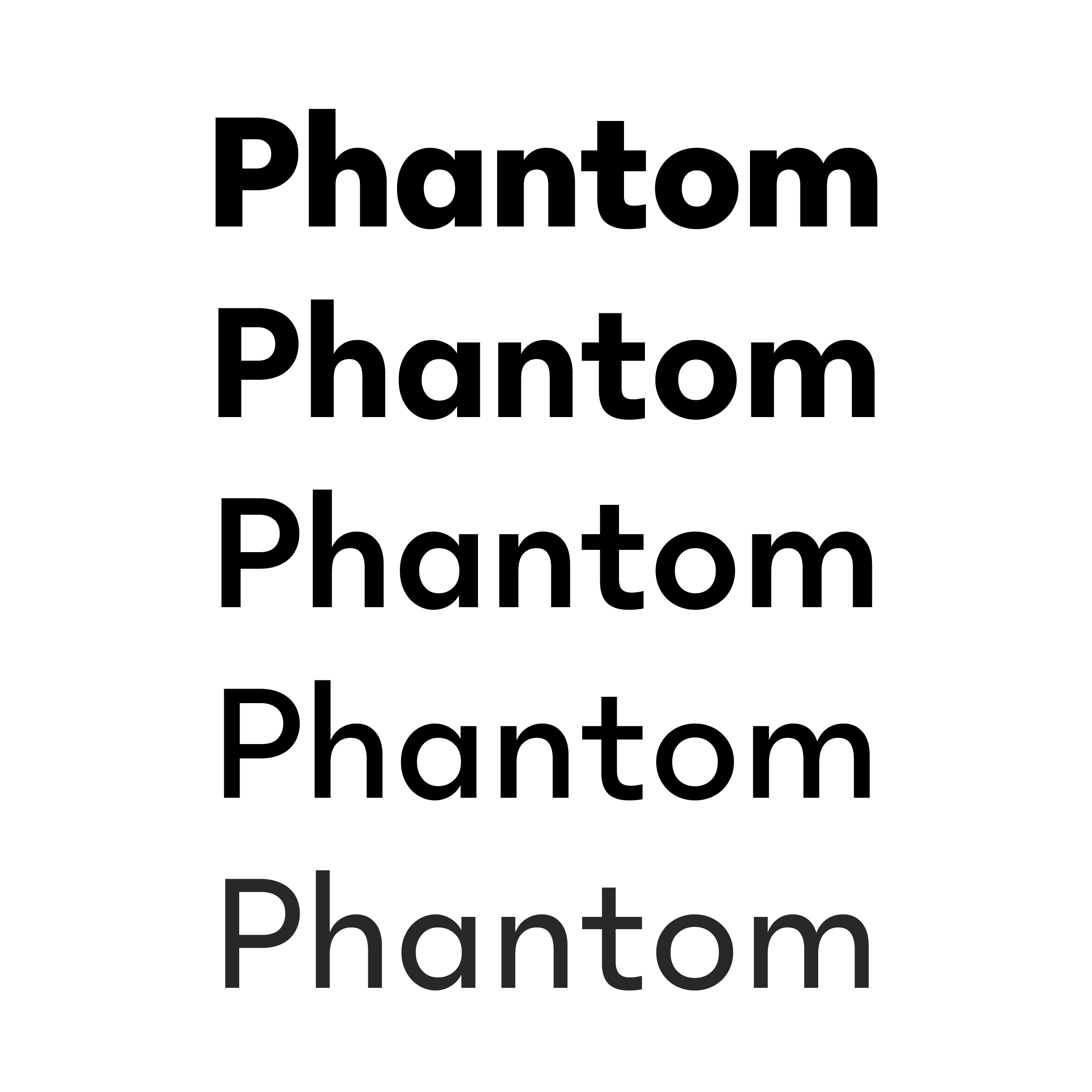
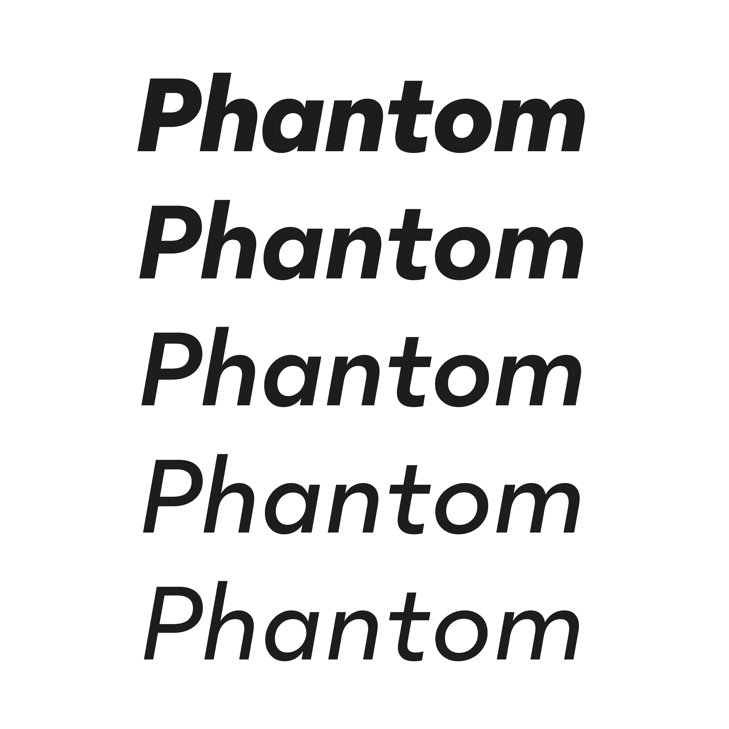
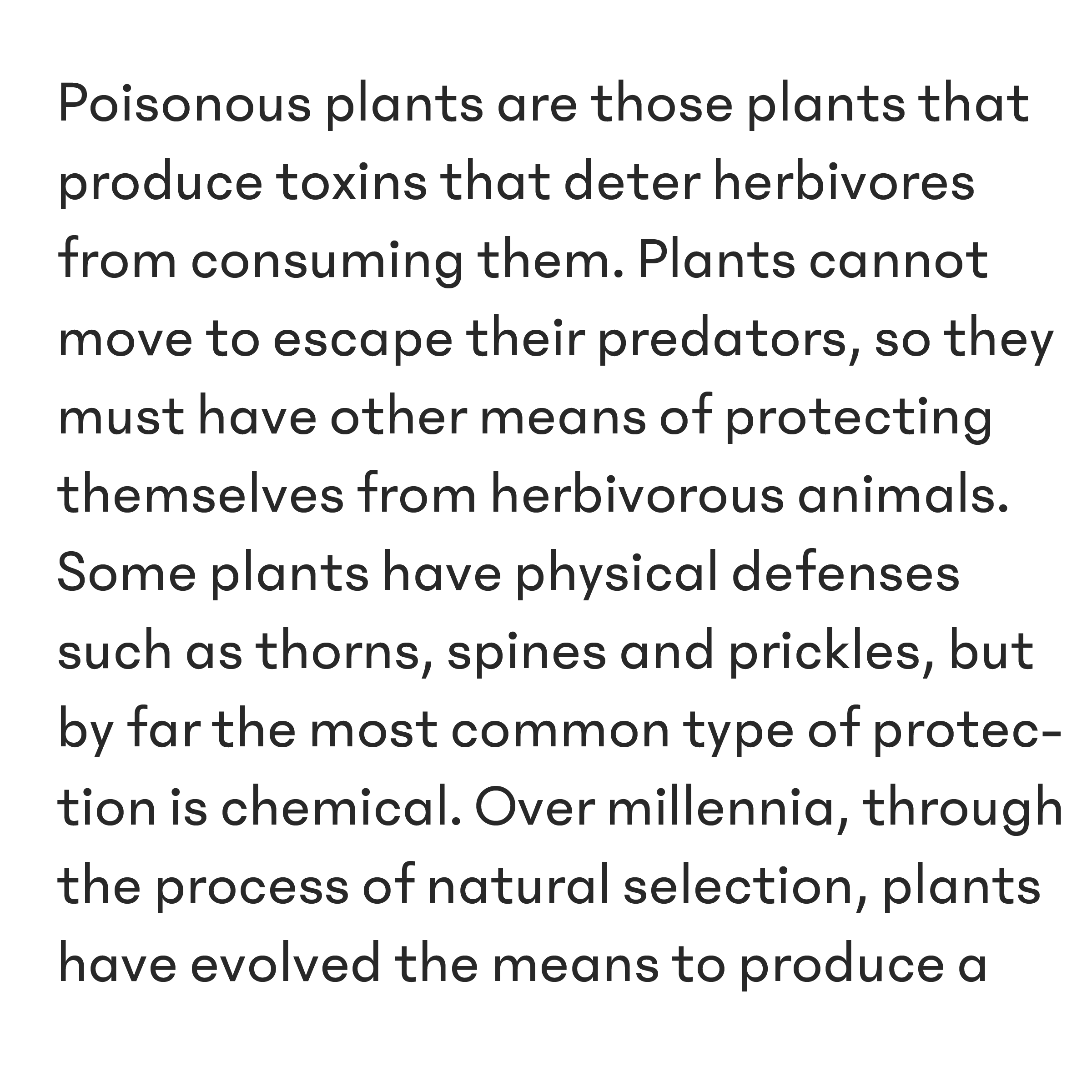
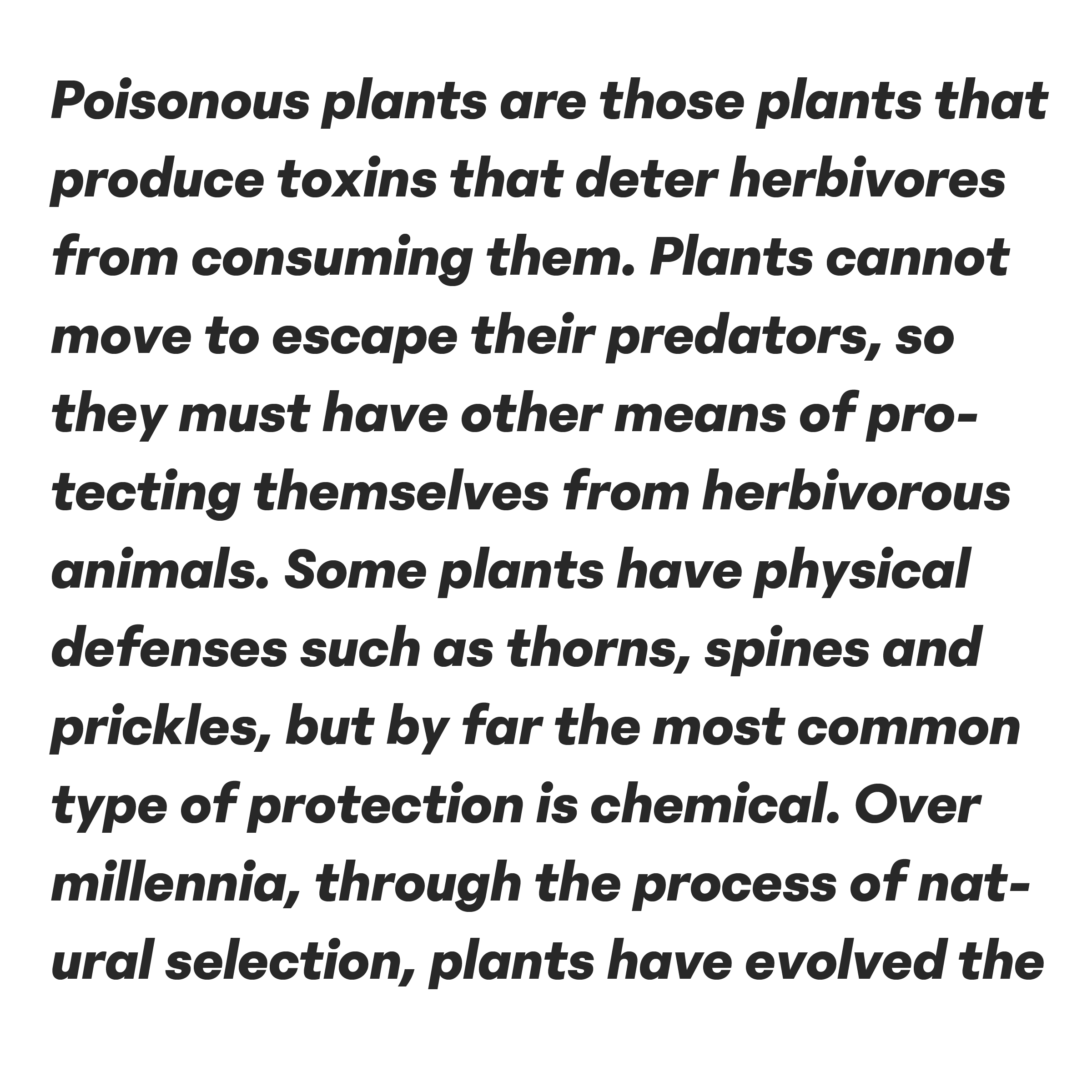
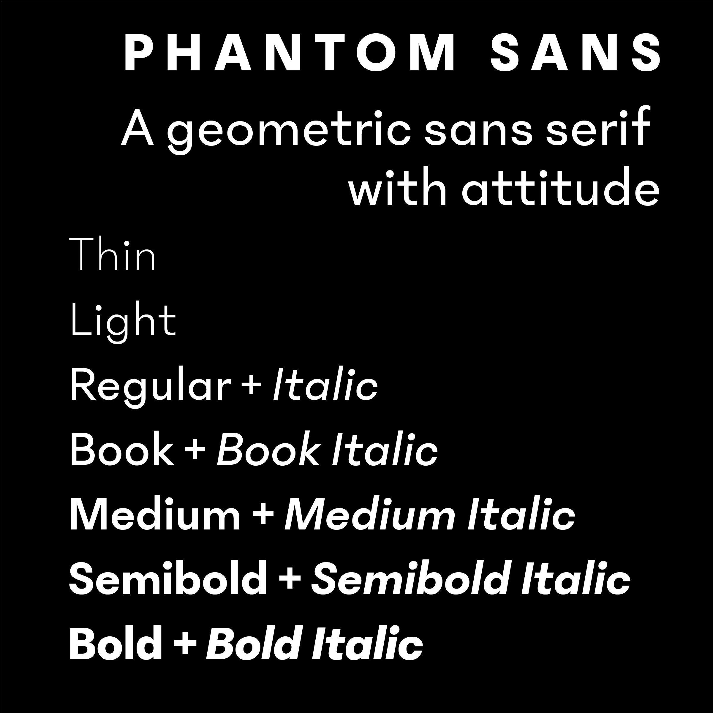
Phantom Sans, a geometric sans with attitude.
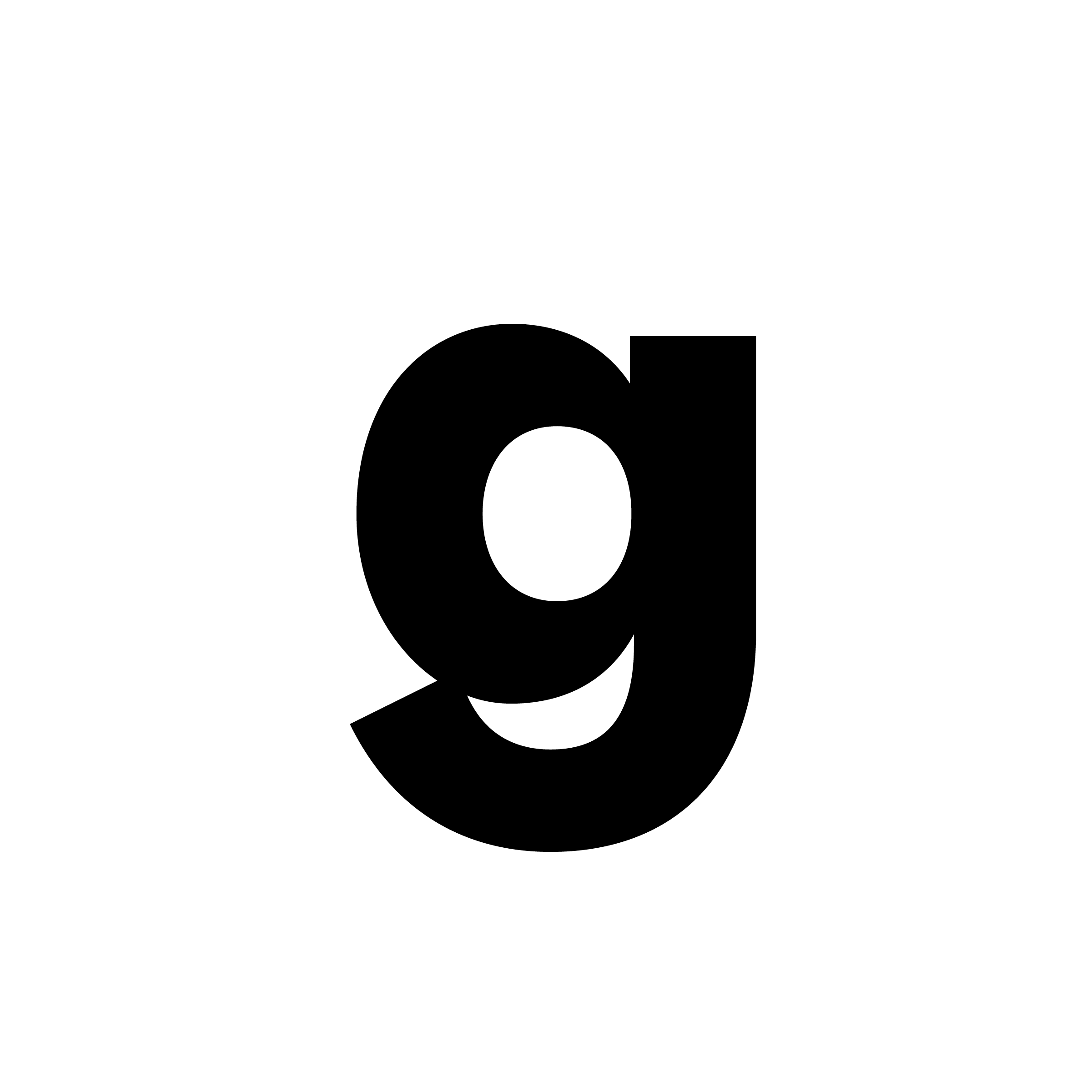
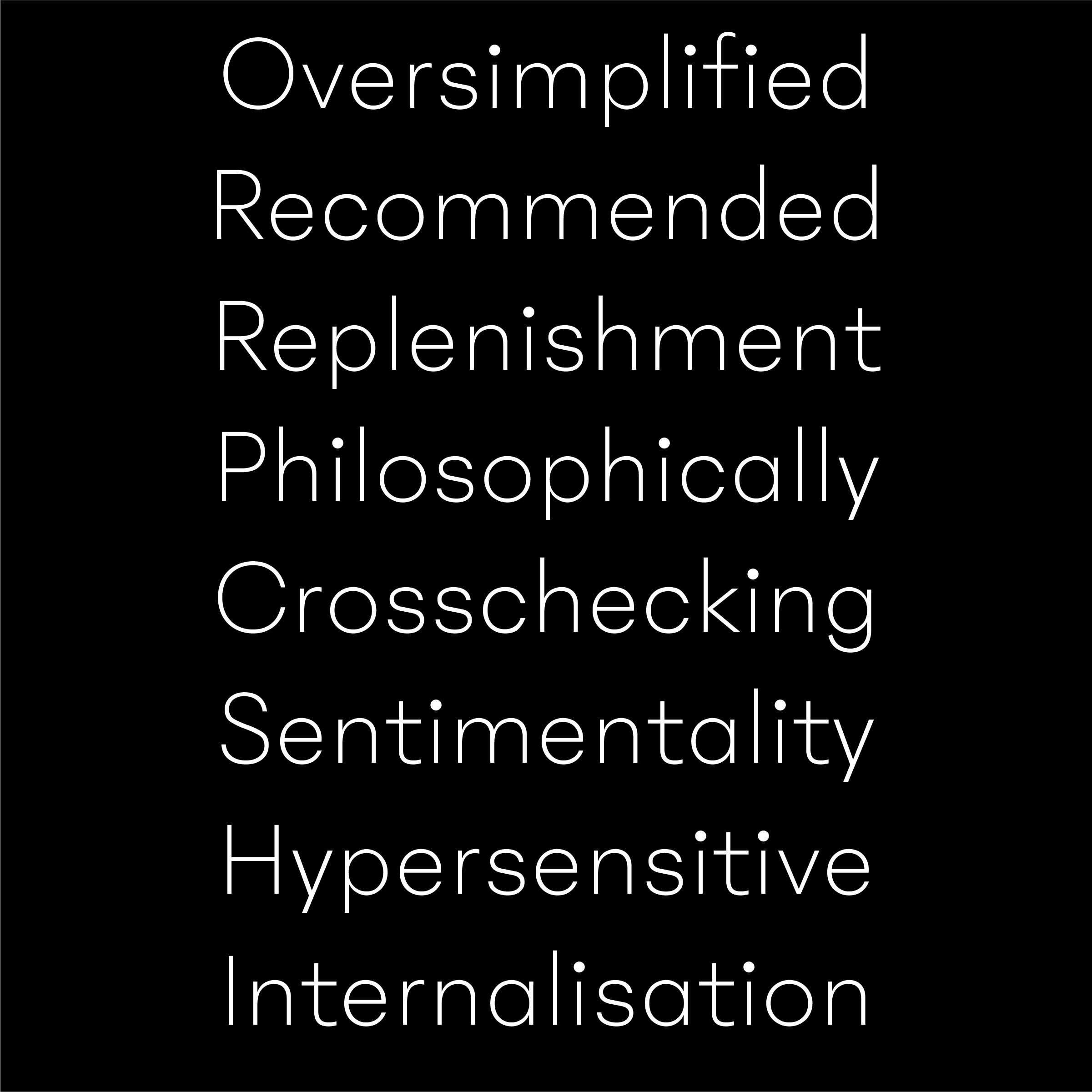
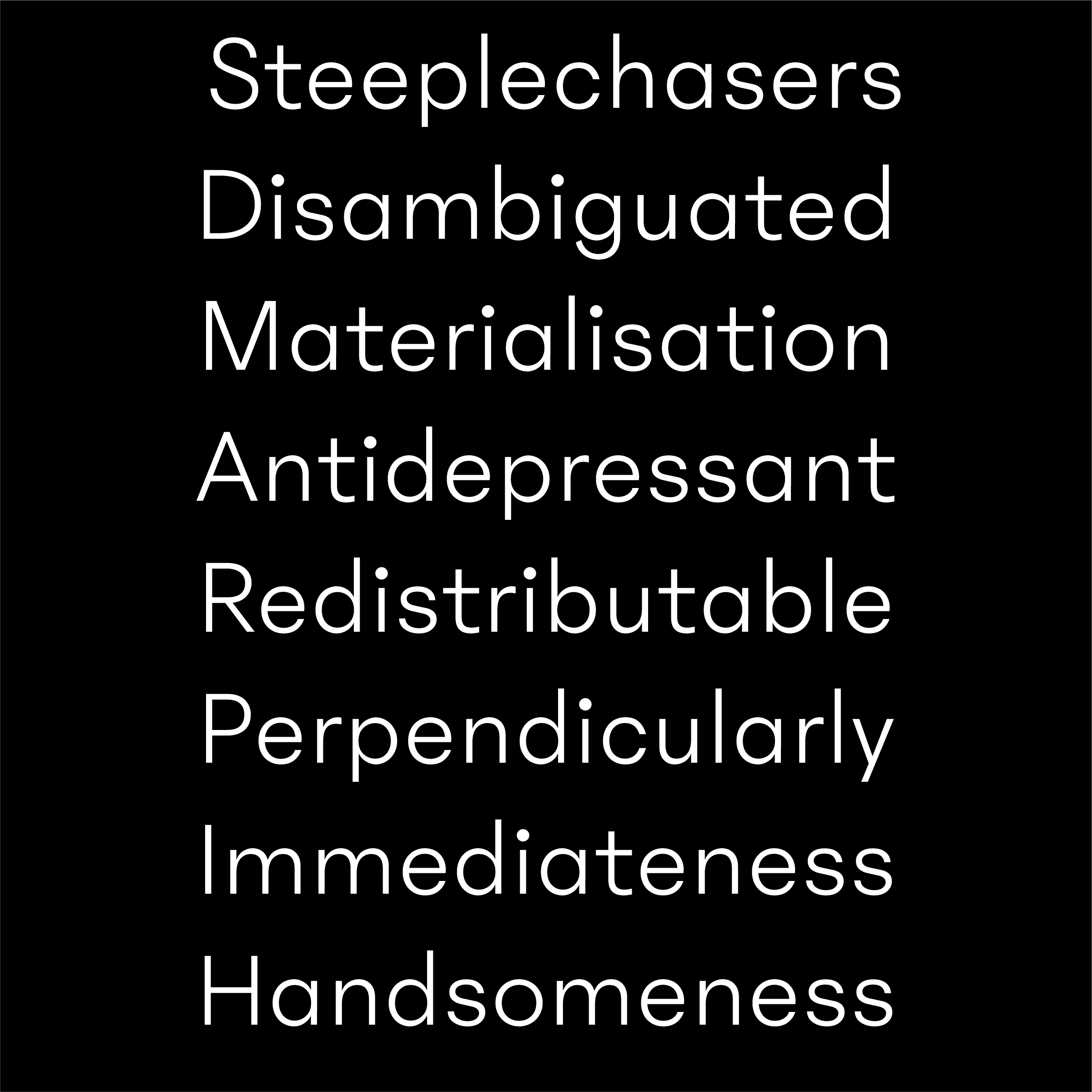
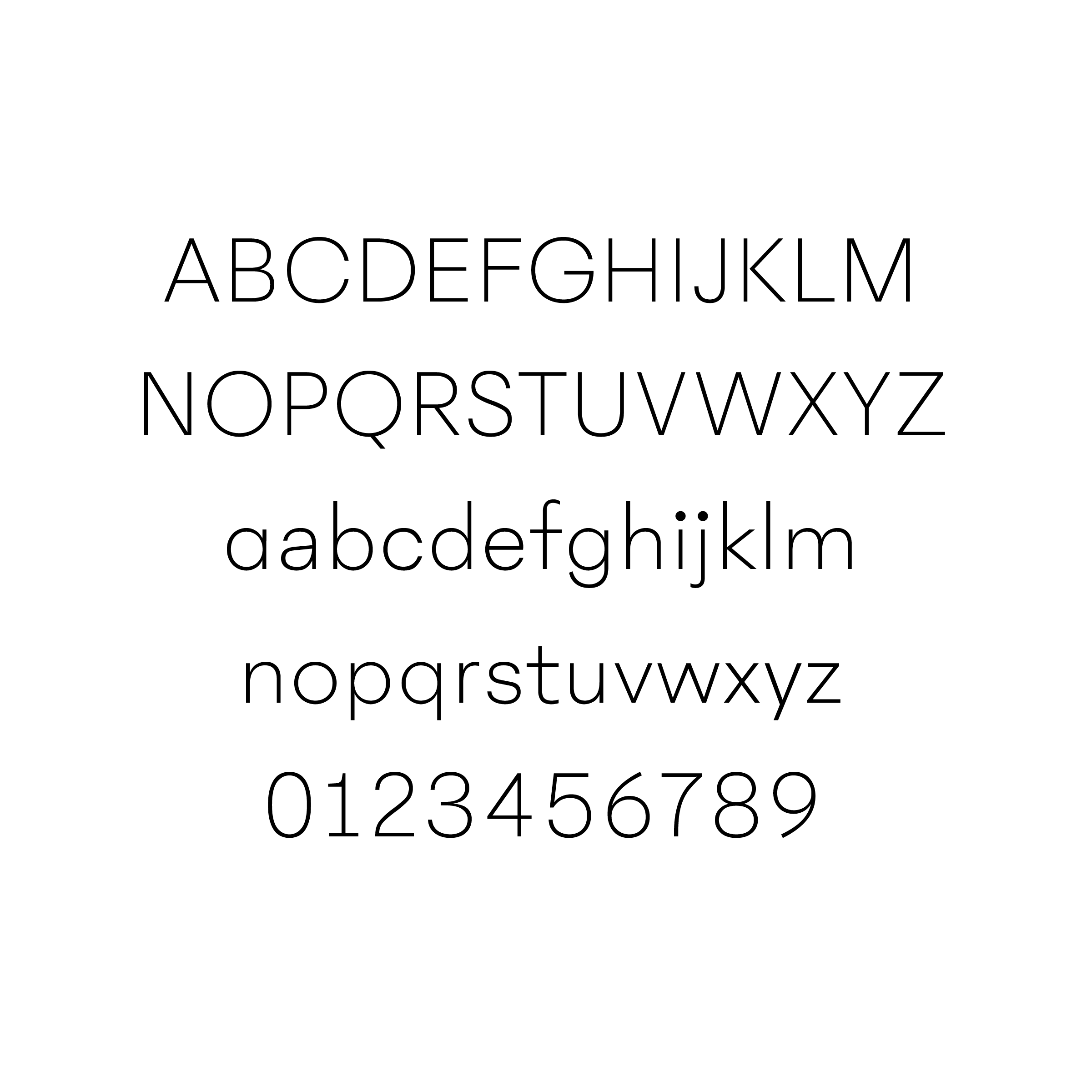
The typographic trend being already overcrowded with geometric sans, Phantom is trying to infuse some warmth and a touch of originality in the genre. I worked on the design for almost two years before I came up with this design that satisfies my requirements. Phantom Sans is a Futura, is a Grotesk, is a Geometric, but Phantom is also more. The dots are bigger than usual, making the text easier to read in small sizes, specially on screen—and giving an inimitable look. The g has a very closed tail, making the font highly recognizable, and quite impactful in bold. The r is wider than usual, letting the words breathe. The t has a hight ascender, to help it stand out. The upper case loosely follows the proportions of Roman Capitals (think Trajan) instead of more even proportions, giving to the typeface a more historic ground and feel. In the same time, the rounds (O of course but very closed C and G) have a radical geometric circular look. It's all about the oscillation between past and present and how to blend an old shape in a modern treatment. Globally all design decisions are made to make the glyphs graphic, and the words flows.
Classic and contemporary as a ghost being here for centuries, Phantom Sans would be at its best in apps, websites or books that seek for radical modernity grounded in history of type.
Phantom Sans is available through FutureFonts as work in progress.