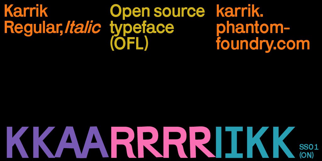
Karrik is an Open Source font published by Velvetyne foundry. Please visite the dedicated website to download the fonts : http://karrik.phantom-foundry.com.
Karrik began as a custom font for Cercle — a French yearly published magazine that explore a different topic each issue. The 2020 theme was (*scary noise*) Ghosts. Since the beginning of the project, it was said that the typeface will be released as a libre font. Because of that I quickly had the idea to team with one of my partners in crime of the collaborative open source foundry Velvetyne: Lucas Le Bihan (who design typefaces through the excellent Bretagne Type Foundry).
One of the challenges we had was to figure what kind of design says “Ghosts” without using clichés of horror movies posters. After a few dead ends we eventually came up with the idea of a font that evokes abandoned and ruined places; a font that looks like the ones you saw on old discontinued electric stations and road signs indicating small and half empty locations; a font inspired by clumsy early sans serif of forgotten type foundries. An echo of long vanished Grotesques — this is what Karrik should looks. We designed the uppercase first, to define a few rules. The rules were: very few optical corrections, uneven width, variation in contrast and weight distribution.
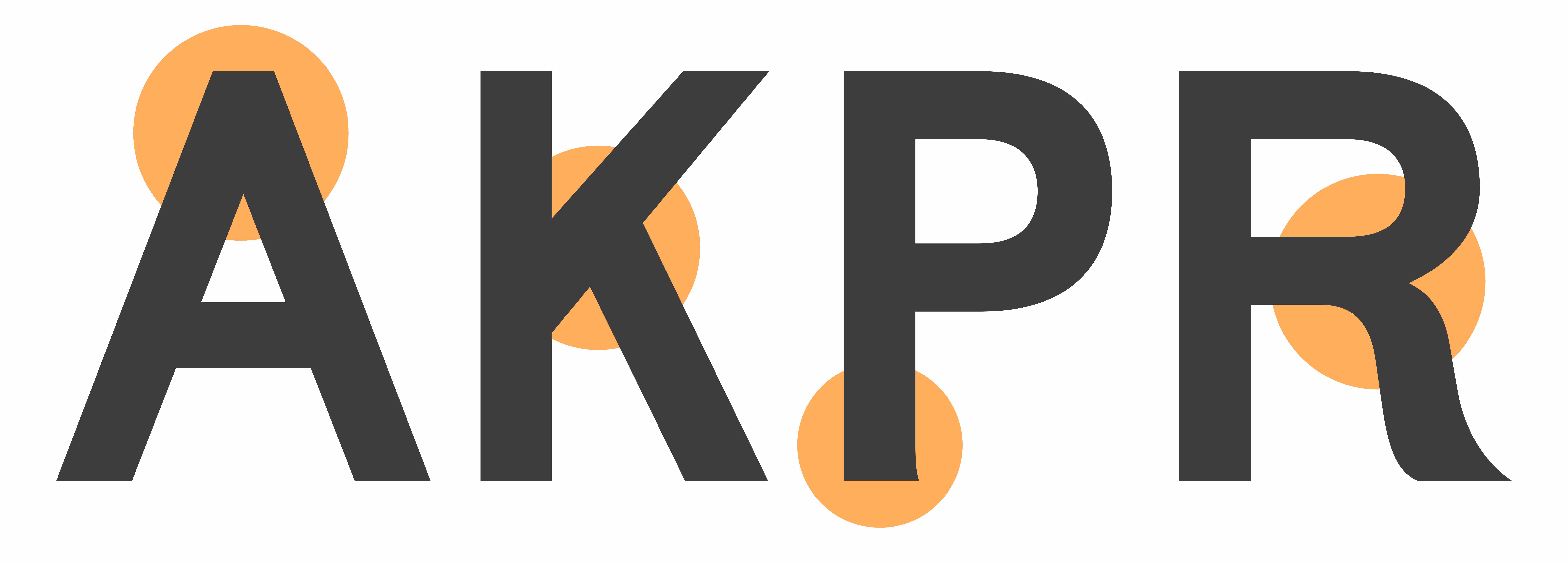
When you design the right way, you had to take extra care of places where stems join, because they look darker than a simple stroke (see K and R for exemple). So the tip of the triangular shapes (like A, V, W, v, etc.) had to be refined to look not too heavy. We didn’t do it. The diagonals in the uppercase A even appear thicker at the top of the letter because of the lack of optical correction. This clumsiness found in old sans-serif is quite charming and make the text vibrant. We also add extra mistakes likes the flares on the bottom of the P. Karrik is full of this errors we learn to resolves during centuries.
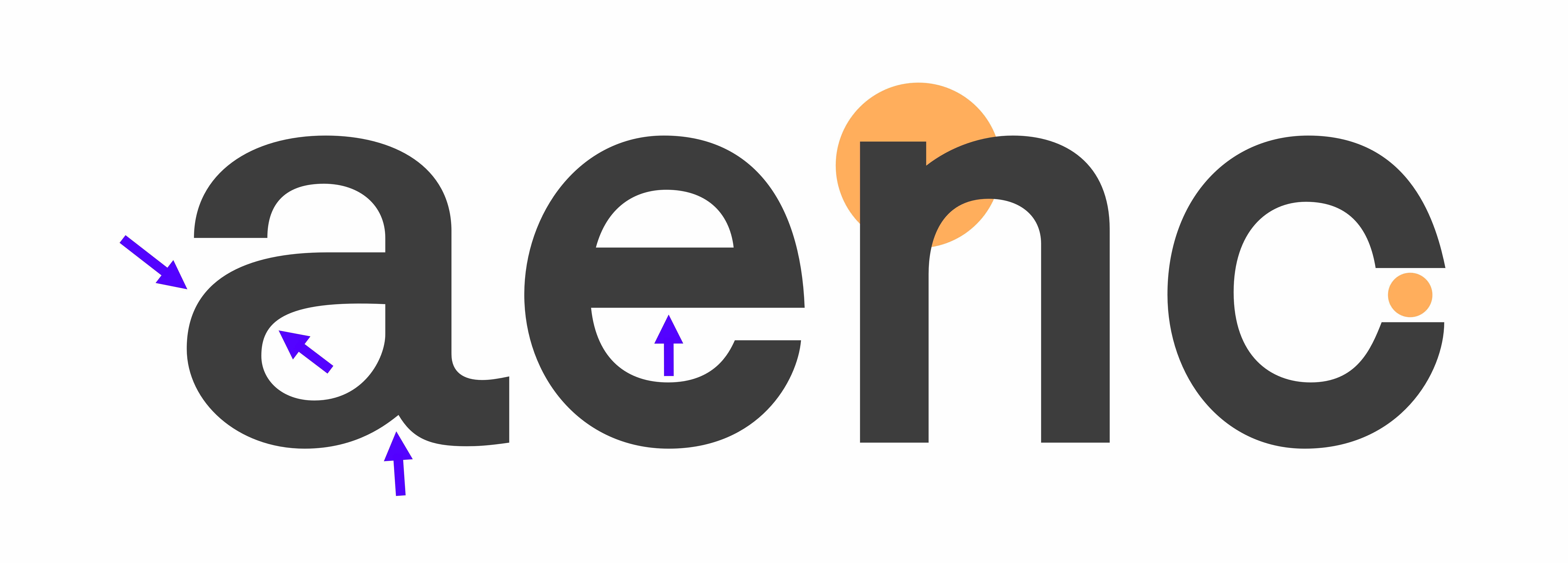
After designing the uppercase, we had the set of rules we needed to draw the lowercase. Again the weight distribution goes against the grain (see the crossbar of the e, the bowl of the a, etc.), the connections remain quite heavy (see the n) and the aperture too closed (see the c) .
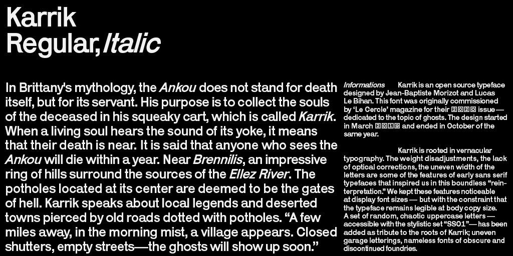
These weight disadjustments, the lack of optical corrections, the uneven width of the letters are noticeable at display font sizes — but yet the typeface remains legible at body copy size.
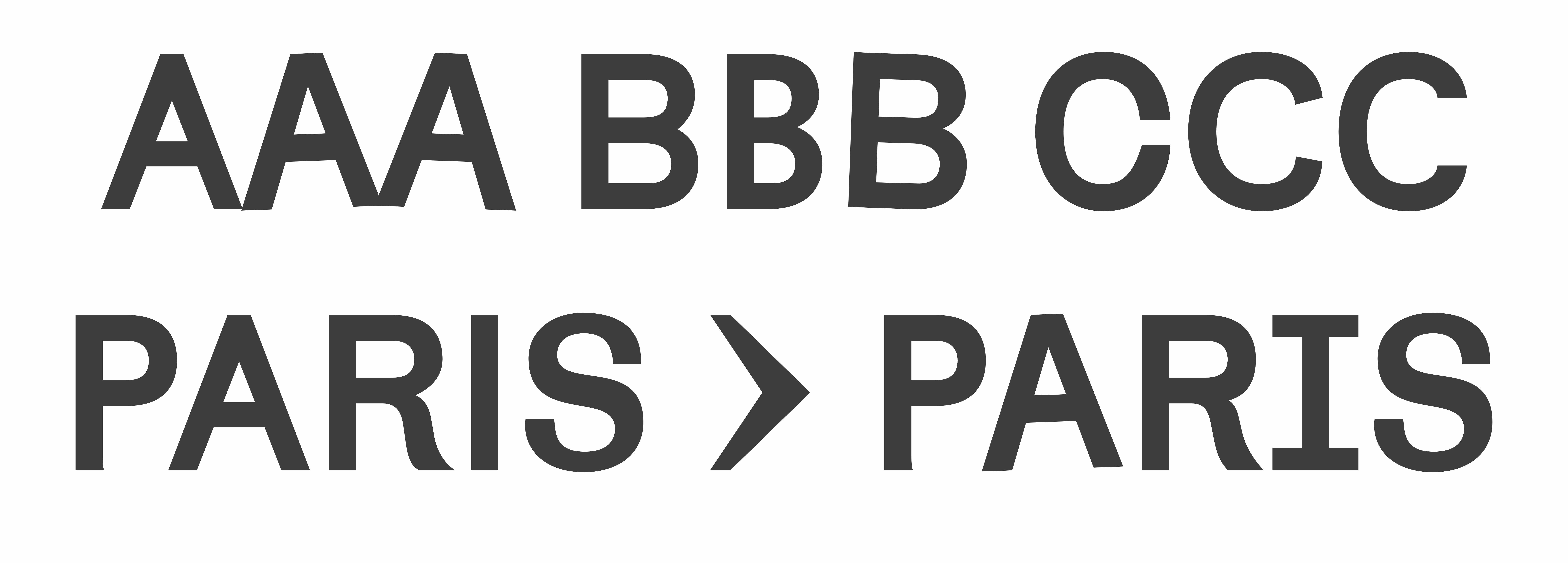
Since Karrik had to evokes “bad” typography, we add a set of random chaotic uppercase letters—they are accessible with the stylistic set “SS01.” They allows more chaos, and bring in this Grotesque the vernacular energy of forgotten garage letterings, and the charm of clumsy nameless fonts from obscure and discontinued foundries.
© 2024 PhantomFoundry
