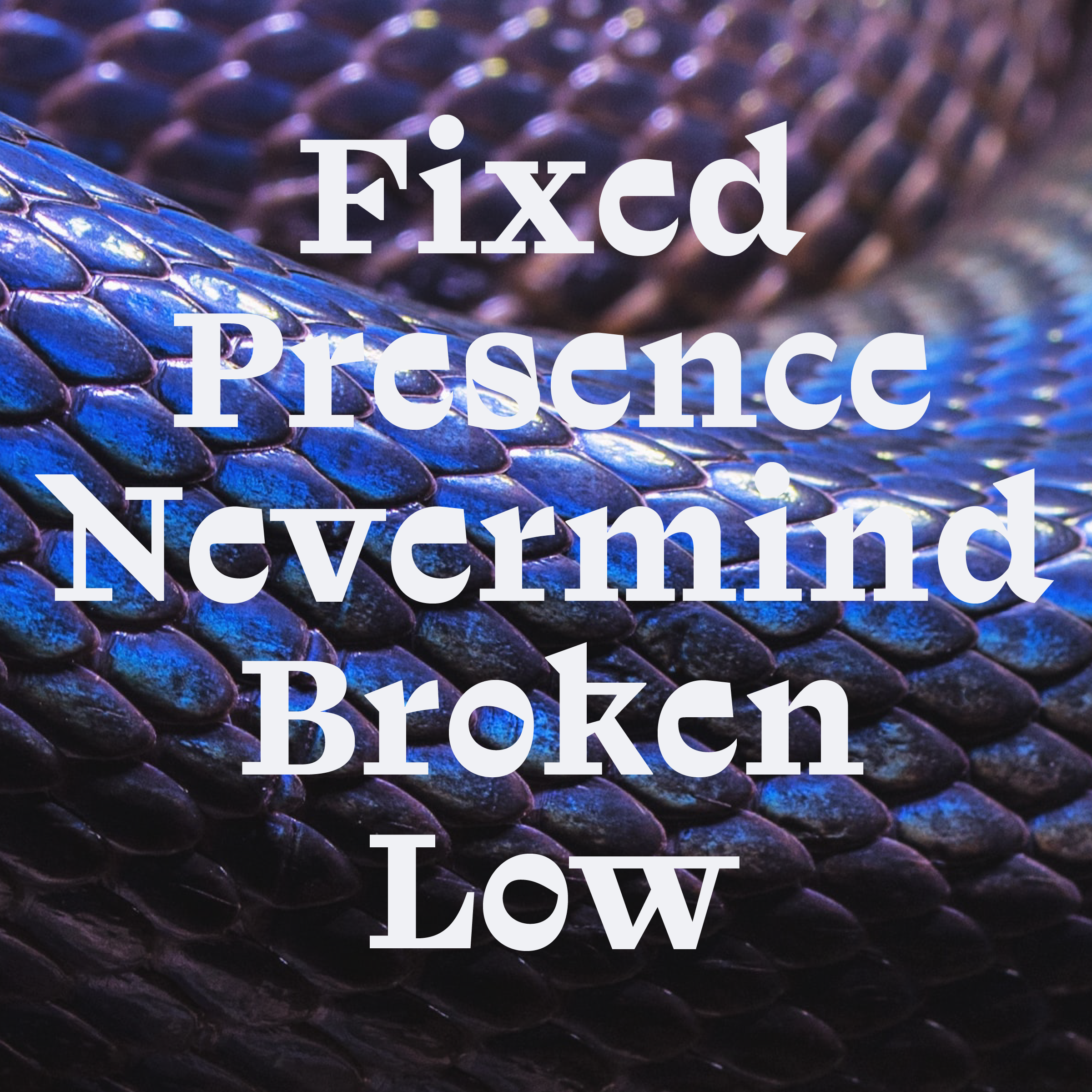
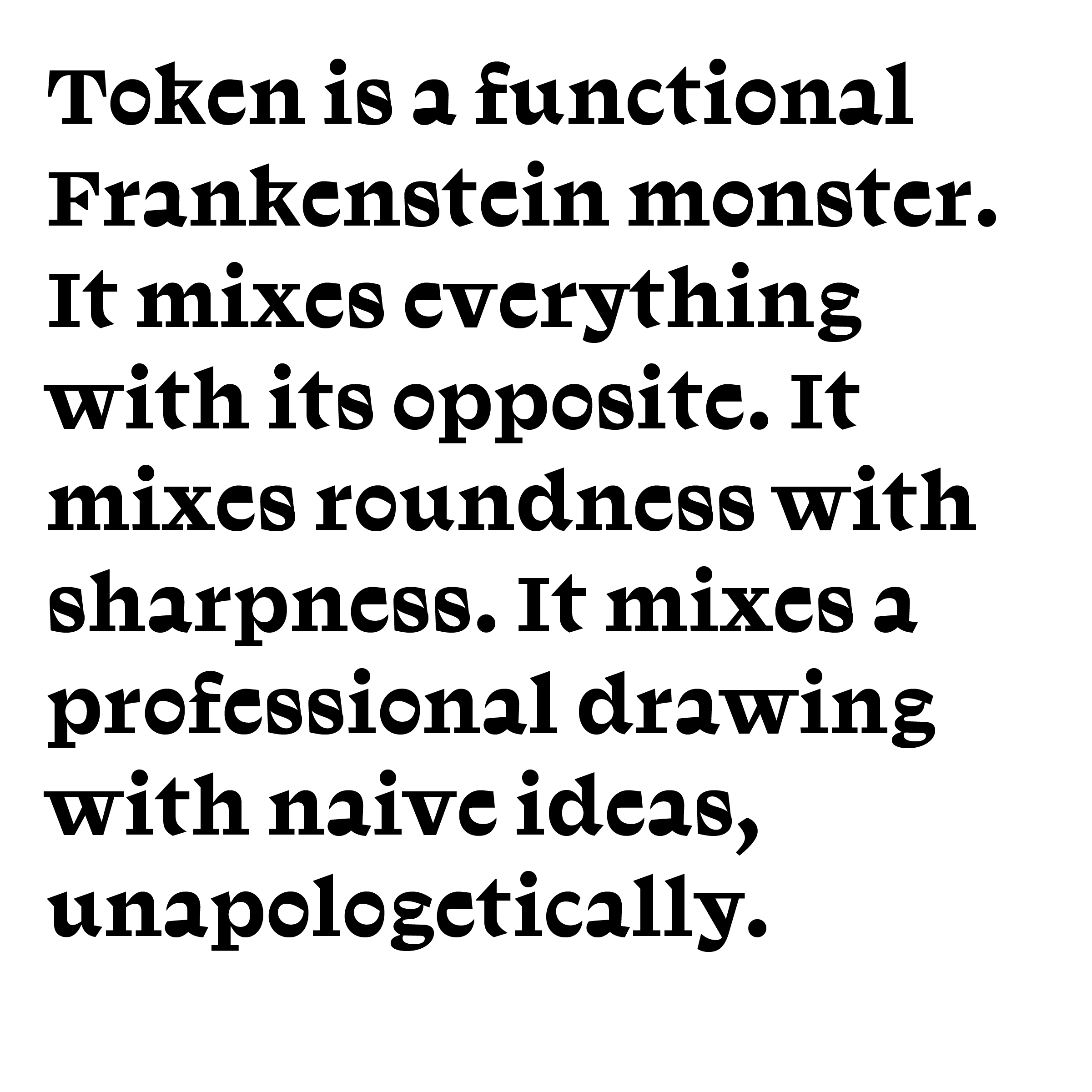
Token is a functional Frankenstein monster. It mixes everything with its opposite. It mixes roundness with sharpness. It mixes a professional drawing with naive ideas, unapologetically, and ruins its elegance with rawness. Look how the low contrast and softness of the curves in letters like “e” or “c” are combined with really sharp spiky endings. Look how the thin start of the upper part of the “a” is combined with a closed fat bowl. Notice the thick to light curve of the “o” and “O.” It shouldn't work but it is: like the way the “y” is deranged and yet flows with other letters, or the way the simply slanted “a” in the italic version named Token Yellow looks like a distorted dotless “i” with a black stain for its bowl.
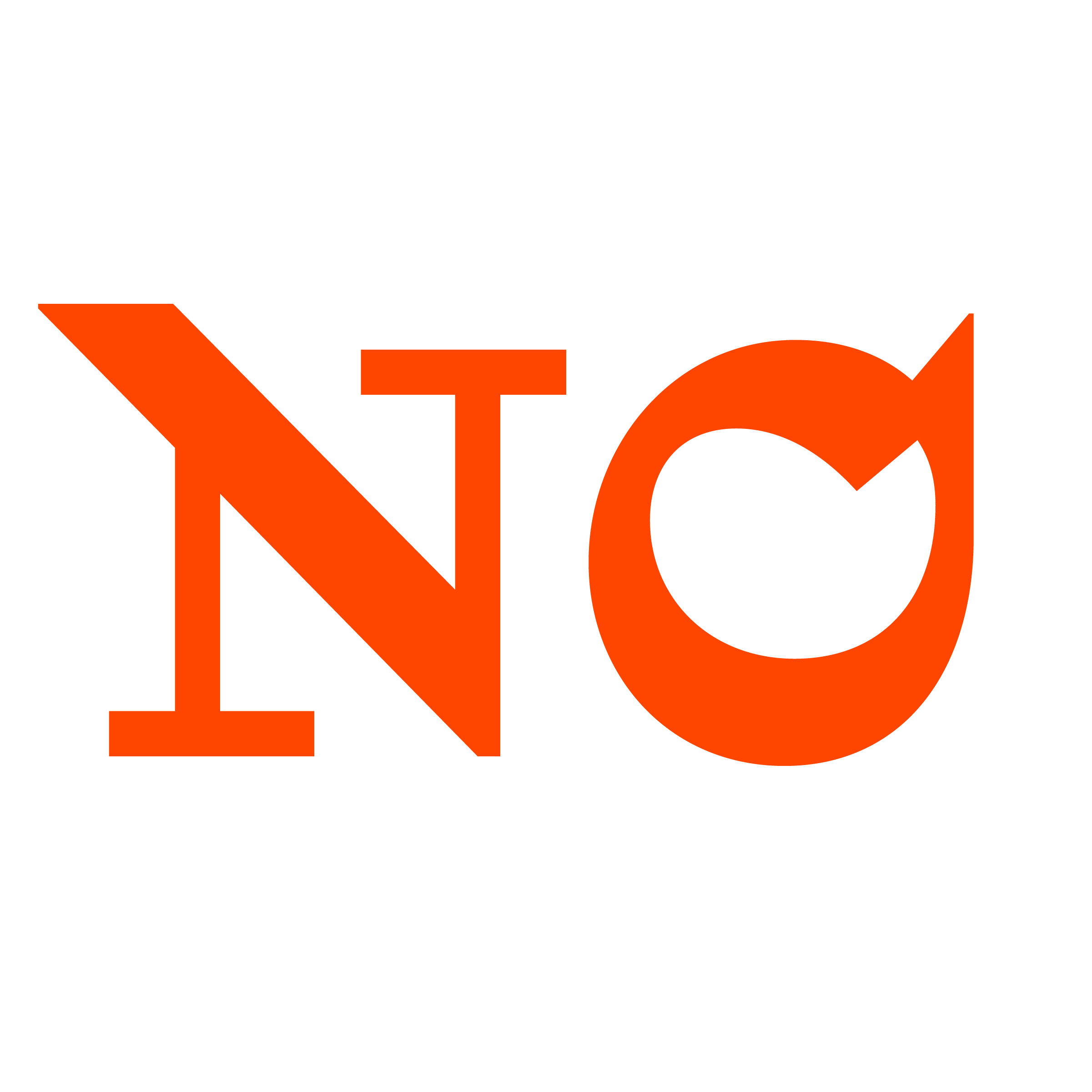
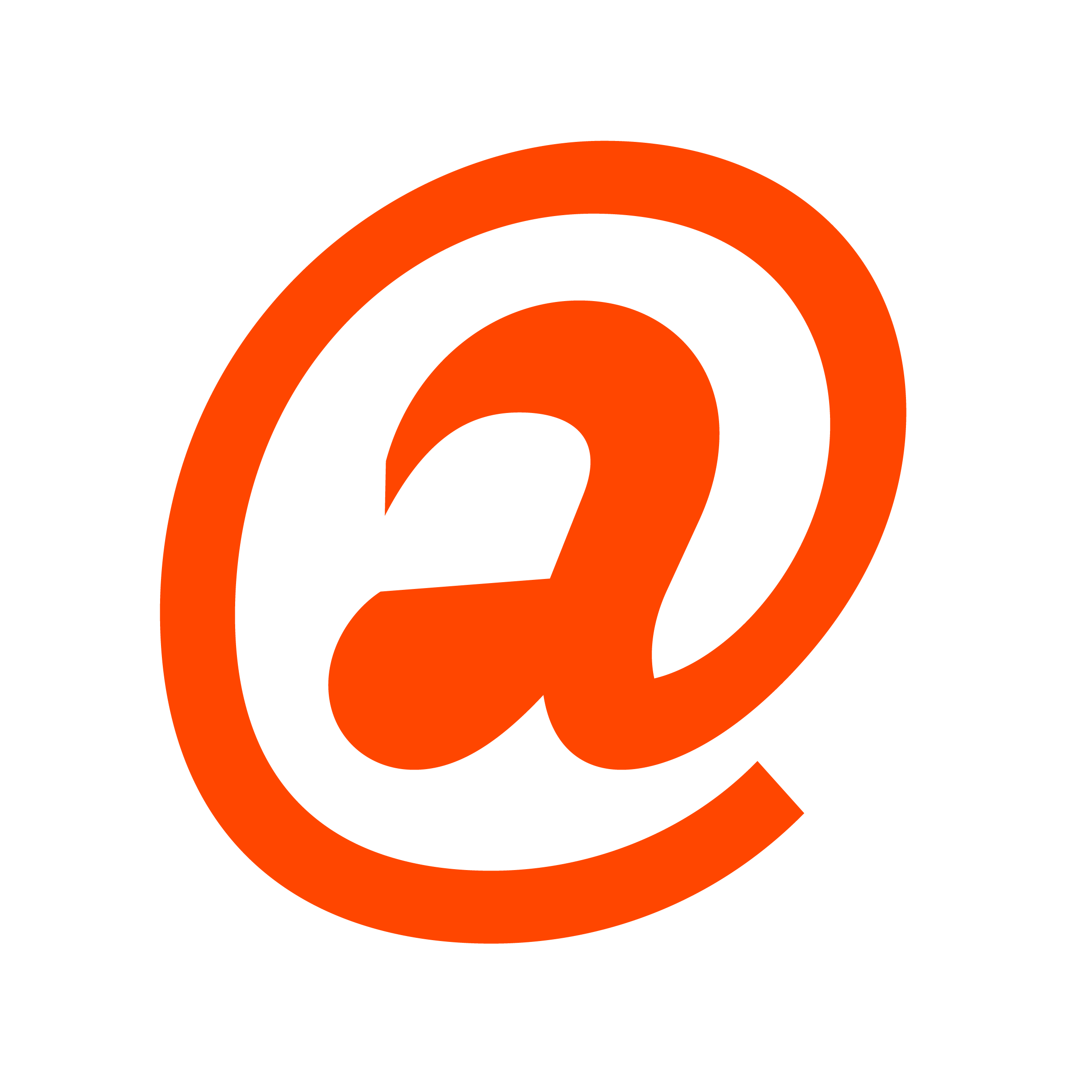
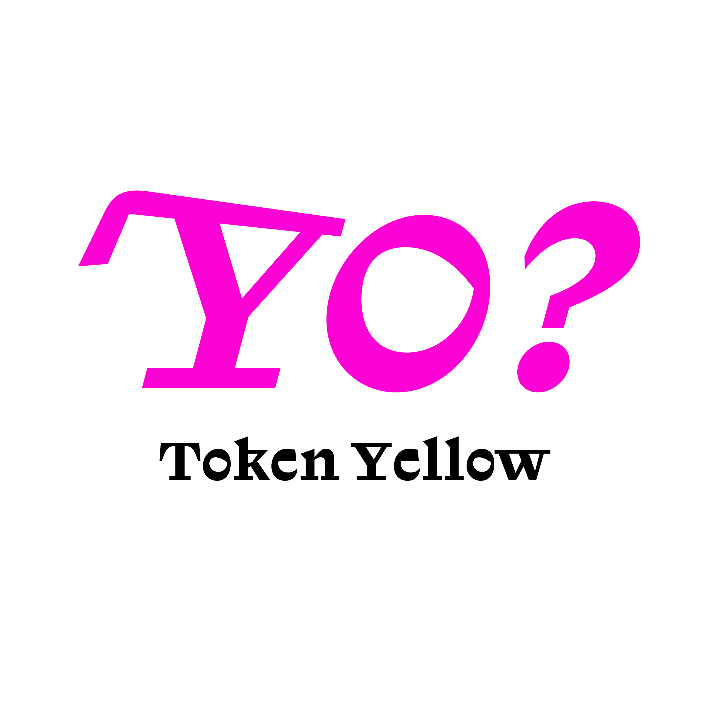
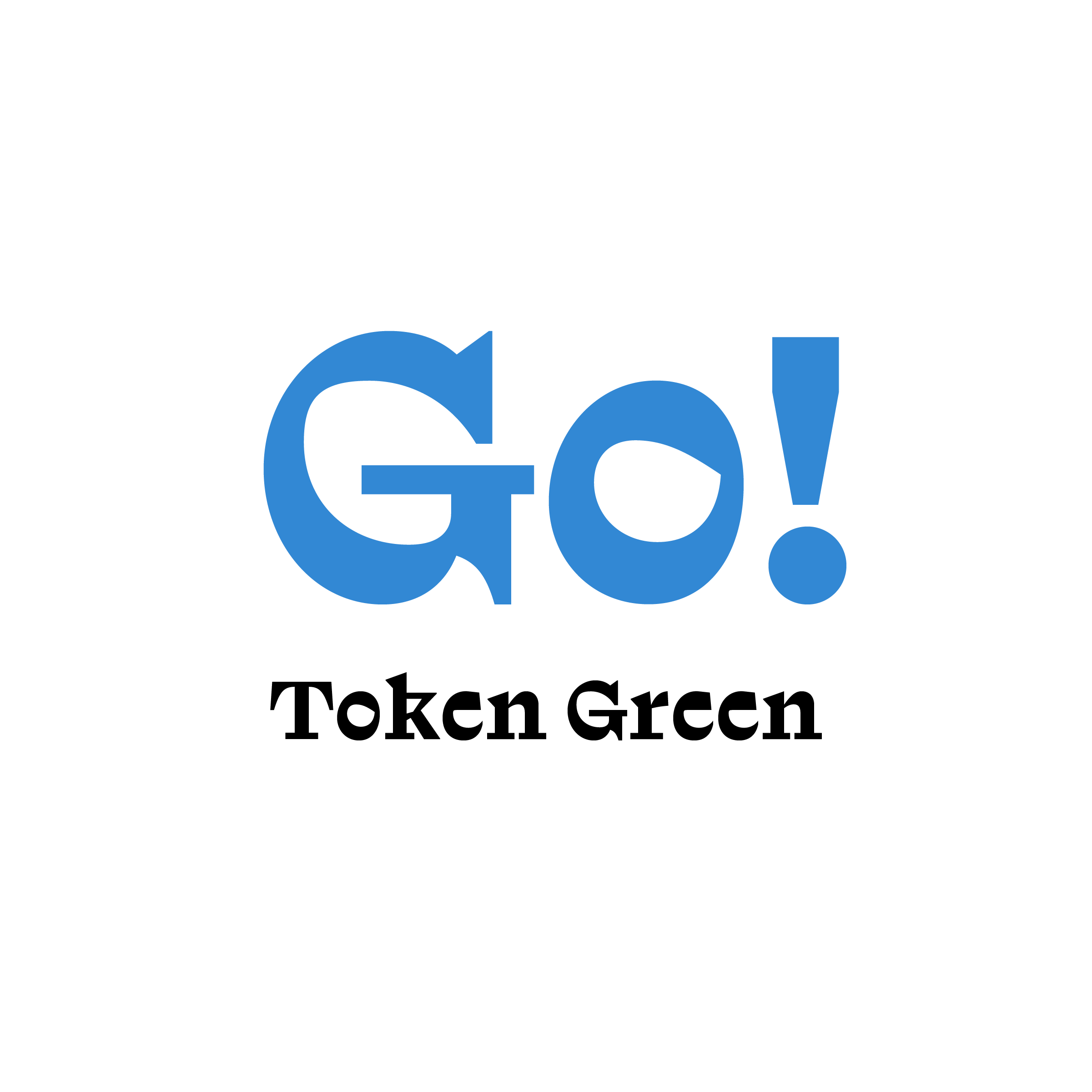
Among other design decisions, Token is a radical take on stained letter-shapes. It fills and blacken what should be simply open. The “a” and “e” apertures obviously, but the connected slab serifs of the “V,“ “W,” “Y,” and “k” close the inner white, like do the vertical serifs of lower case “s”. It helps Token to create interesting word-shape easily.
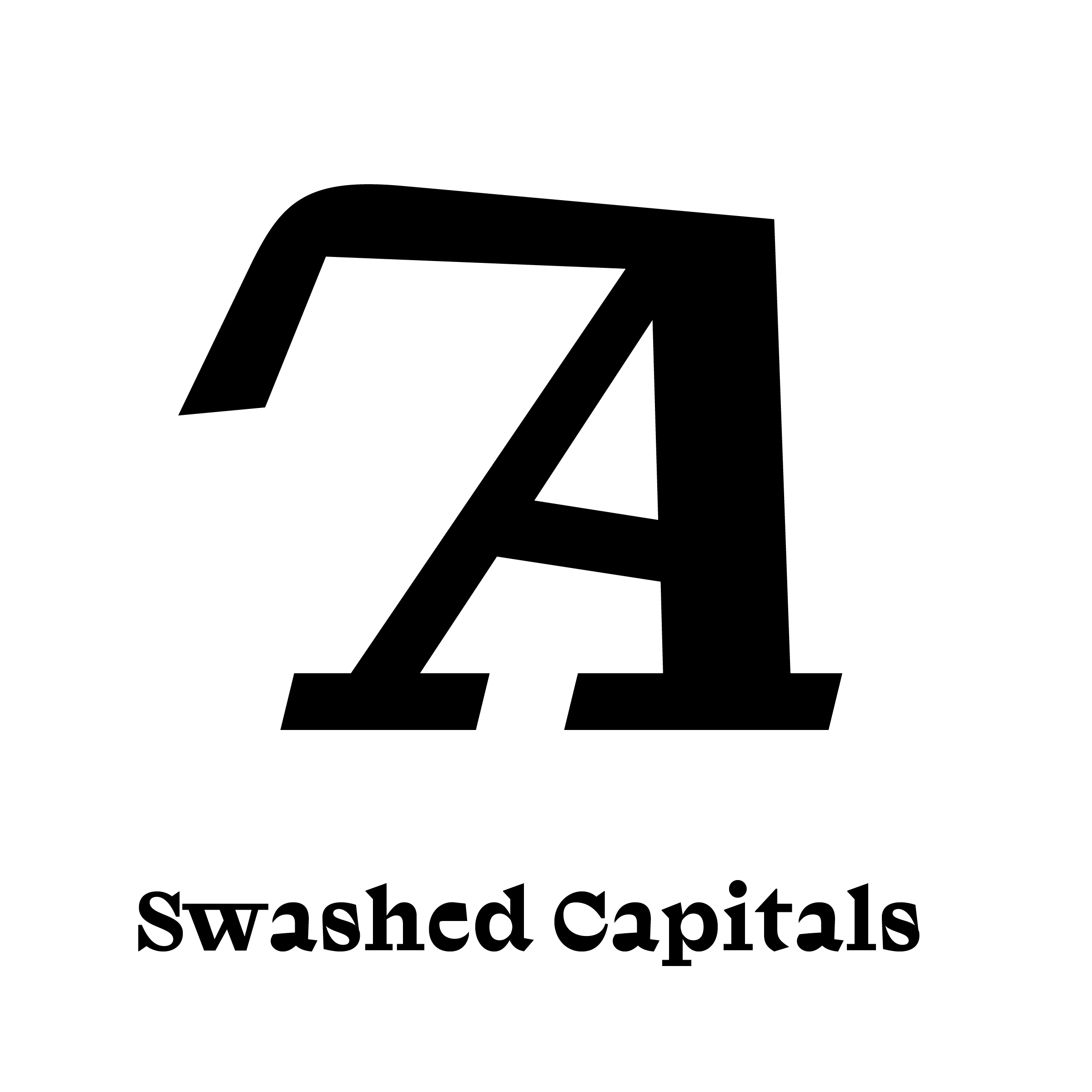
Token comes from a try to make a spiky latin serif mixed with geometric shapes (in first draft, the head of the “g” was a simple square). The family ends up as a slab serif, but the pointy style remained important. The thin stem/shoulders connection in ”n” and “m“, the triangular top serifs, but also the hedgehog aspect of the alternate upper case explore this thorny art direction. So if you want your headline not noticed and the letters showing off on the canvas, Token Green is your tool.
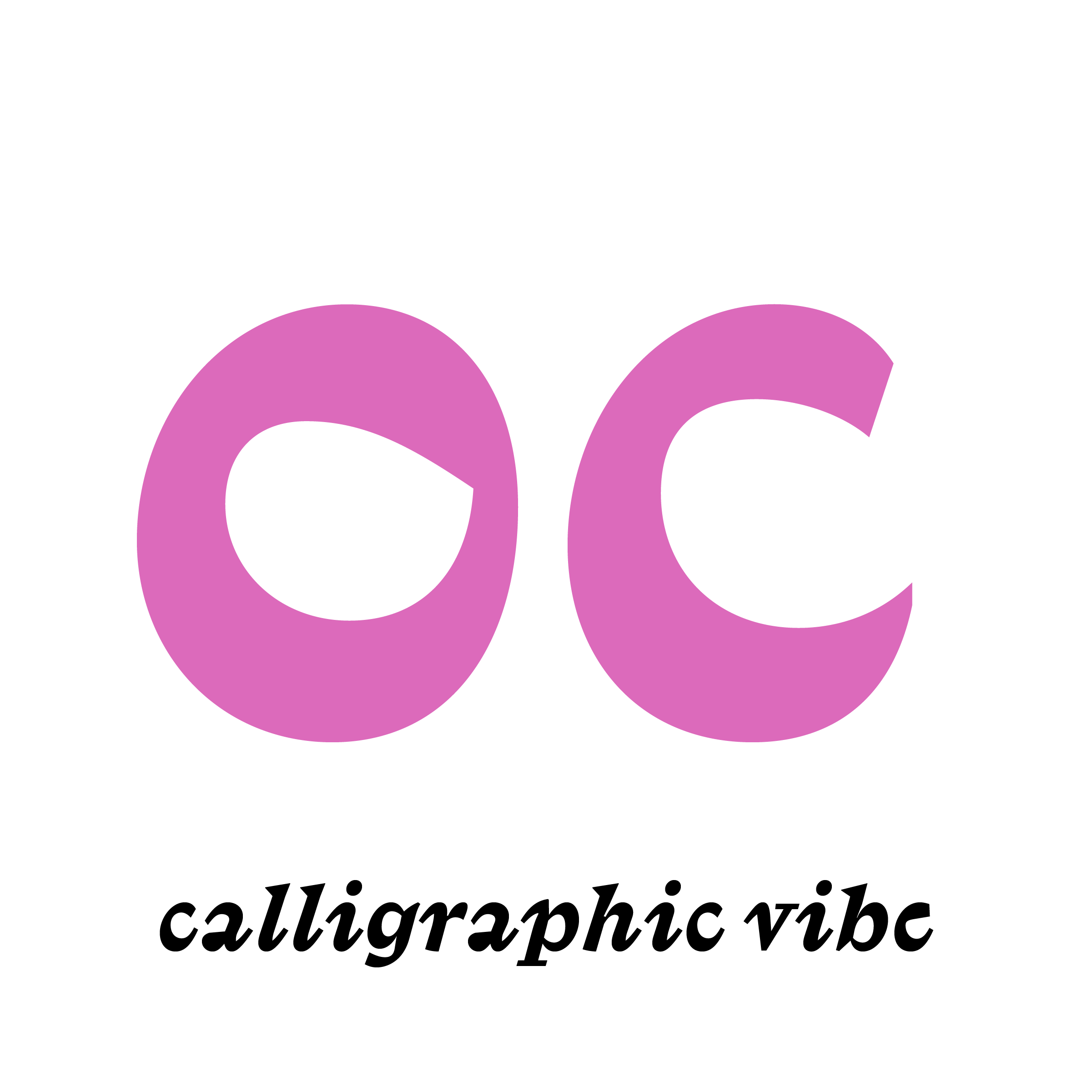
In the same time, the italic is not following exactly this path, — using long straight serifs where more calligraphic and sharp exits could have been chosen. It reveals another influence at work in Token: monospaced typefaces. The closed serifs (in V, H, etc.) and the wide straight stroke exits of the italic come from typewriter fonts. It allows you to modulate the strong voice of the Bold with something else.
